A Metro Experience Redesign: From Chaos To Flow
A service design research project mapping the friction points across seven stakeholder groups at Pune Metro stations, resulting in a proposed station layout and service blueprint that redesigns the ticketing, security, and helpdesk flow.
My Role: Service Designer | UX Researcher
The Problem
Pune Metro is a new, growing system — but even in its early days, the entry experience felt chaotic. In a stretch of just 15 metres between the ticket counter and the entry barriers, passengers were visibly confused, flows were colliding, and staff were constantly intervening. Ethnographic research confirmed what was immediately observable: this small zone was dense with friction.
The Process
I conducted ethnographic field research across seven stakeholder groups—customers, help desk staff, ticket counter employees, security, cleaning staff, announcement control, and the metro driver.
I identified key problem areas, as outlined below.
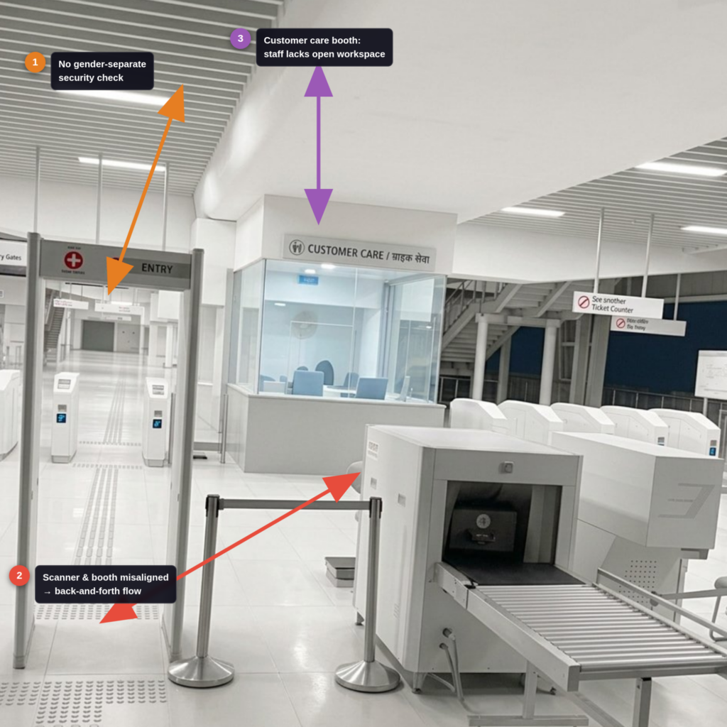
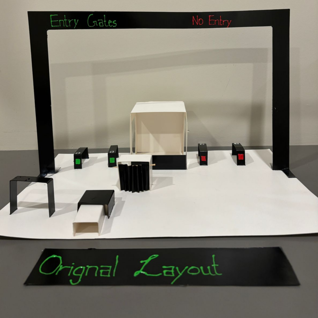
- No Gender-Separate Security Check: There was no dedicated screening lane for women. Men and women queue through the same metal detector arch. Indian security protocol requires a separate women’s frisking area — its absence creates both a compliance gap and discomfort.
- Poor Scanner–Booth Layout (Back-and-Forth Flow) This was the biggest flow problem. The sequence is: place bag on scanner → walk through security arch → wait for bag to emerge on the other side — but the women’s security booth is positioned between the entry point and the scanner exit. So women have to go through security first, then walk back to collect their bag. This forces an awkward, counter-intuitive loop.
- Customer Care / Help Desk — No Open Workspace: The staff booth is too enclosed and compact. There’s no open counter space for staff to assist passengers while seated, so employees end up standing throughout their shift. A more open-plan desk would improve both staff comfort and passenger interaction quality.
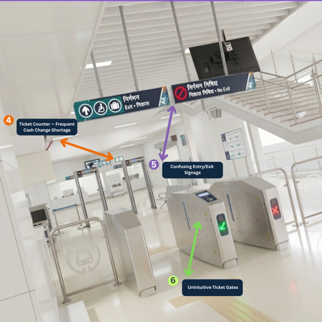
4. Ticket Counter — Frequent Cash Change Shortage: The ticket counter regularly runs out of small change, causing queues to stall. Since many passengers buy low-value tokens with larger notes, this is a daily friction point.
5. Confusing Entry/Exit Signage: Both “Entry” and “Exit” signs were placed on gates that only allow entry. A passenger walking in sees an Exit sign and genuinely doesn’t know if they’re at the right gate — especially first-time users.
6. Unintuitive Ticket Gates: The gates were open by default. If your ticket doesn’t scan properly, they suddenly snap shut and hit you. This is startling and unsafe. A better design keeps the gate closed and only opens it after a successful scan, which is the standard at most modern metro systems.
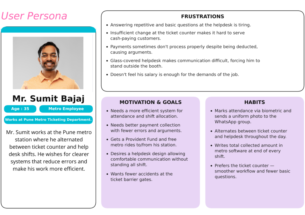
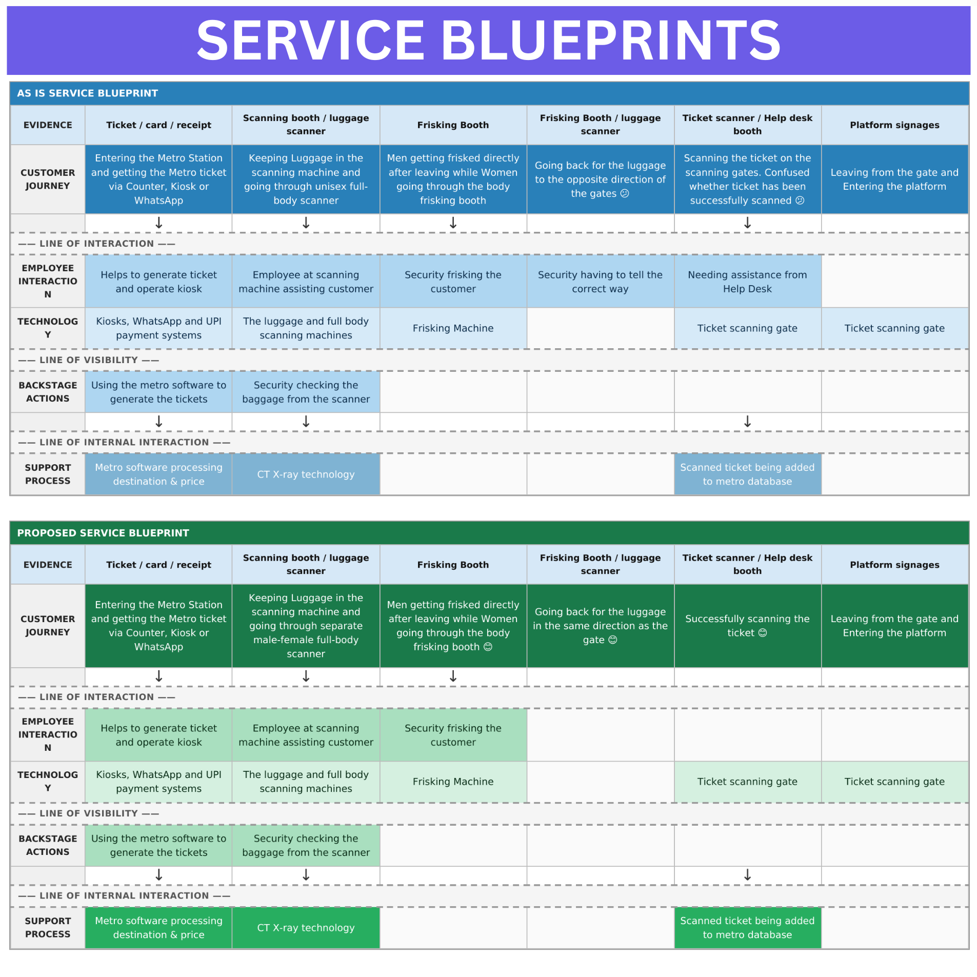
These insights informed the creation of an as-is service blueprint, along with journey maps and personas for ticket counter and help desk employees. Through ideation methods such as LEGO Serious Play and storyboarding, I developed an as-if service blueprint proposing improved experiences
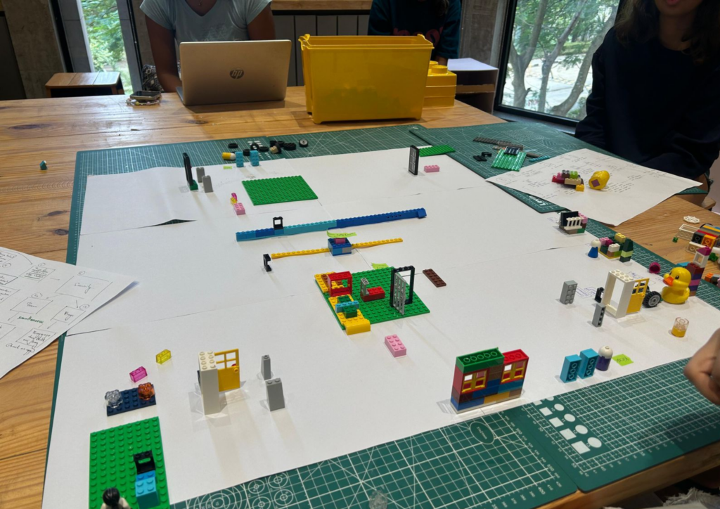
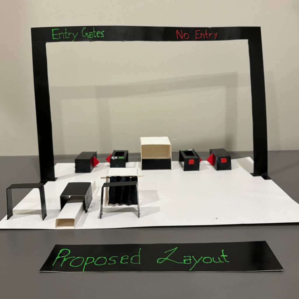
These insights were then translated into a 3D cardboard prototype of the redesigned station layout.
The Outcome
The proposed station layout reorganized the placement of the ticket counters, kiosks, security booths, and barriers to create a single, logical flow.
Notable Changes Include:
1. Gender-Separated Security Screening: The proposed layout introduces dedicated screening lanes for men and women. A separate women’s frisking booth is positioned within the flow so female passengers no longer share the same metal detector arch as men. This resolves the compliance gap with Indian metro security protocol and removes the discomfort caused by a shared, unisex check.
2. Redesigned Scanner–Booth Layout (Linear Flow): The bag scanner and women’s security booth are repositioned so the flow moves in a single direction. The new sequence is: place bag on scanner → walk through the body frisking booth → collect bag from the scanner exit on the same side you’re already walking toward. Passengers no longer need to double back.
3. Open-Plan Help Desk / Customer Care Booth: The enclosed booth is replaced with an open-counter helpdesk design. Staff can now assist passengers from a seated position with a clear, unobstructed counter in front of them. This improves both employee comfort across long shifts and the quality of face-to-face interaction with passengers.
4. Corrected Entry/Exit Signage: Signs are repositioned and corrected to accurately reflect the function of each gate. Entry-only gates display only the Entry sign; exit gates display only the Exit sign.
5. Gate-Closed-by-Default Design: The ticket scanning gates are redesigned to remain closed at rest and open only after a successful scan is confirmed. This eliminates the jarring, unsafe experience of gates snapping shut unexpectedly mid-passage. The new logic is the standard used at most modern metro systems and makes the scanning process intuitive and predictable for all passengers.
The Impact
Reduced operational chaos by addressing friction in the critical 15-meter zone between the ticket counter and entry barriers. Improved daily workflows for ticketing and helpdesk staff through system-level changes across stakeholder touchpoints.