Redesigning UPI for Smarter Financial Decisions
This was an interdisciplinary project involving students from design, business, finance, and psychology. We conducted a UPI spending behaviour study using 54 surveys and 30 interviews. The insights were translated into six redesigned UPI screens that embed category-based budgeting and behavioural nudges into the existing payment flow, enabling more financially informed decisions.
My Role: UX Researcher | Product Designer
The Problem
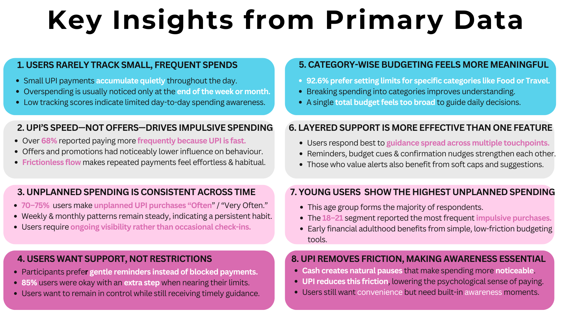
According to PIB India, UPI processes over 20 billion transactions a month. The same frictionless design that made it ubiquitous also made overspending invisible. According to our primary research, 70–75% of users were making unplanned purchases regularly, with most only noticing it at the end of the month.
The problem wasn’t willpower; it was the interface. UPI was built entirely to move money, not to help users think about money.
The Process
We approached the problem through a structured, step-by-step process, starting with research into current UPI usage patterns, behaviours, and industry insights.
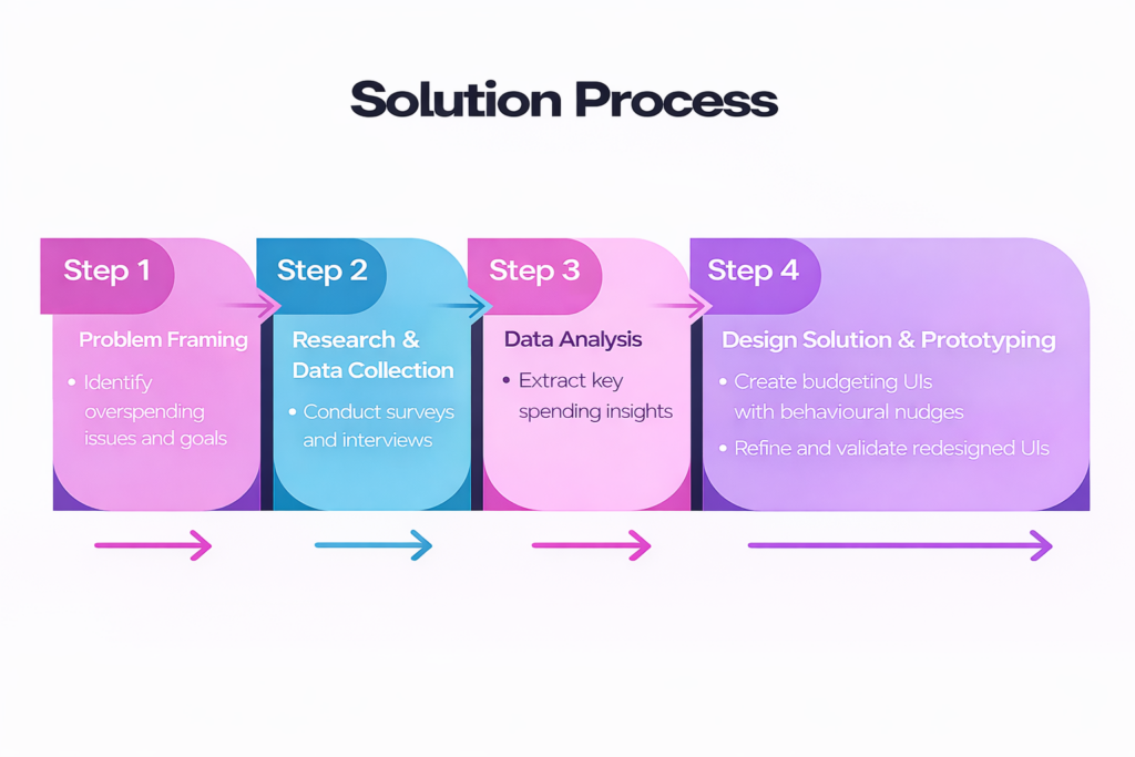
1. Problem Framing: Secondary research revealed that frictionless UPI systems reduce the ‘pain of paying,’ leading to increased impulsive and unplanned spending (Hahn et al., 2012). Based on this, we framed the opportunity: To turn UPI into a behaviorally intelligent companion for intentional spending—without compromising convenience.
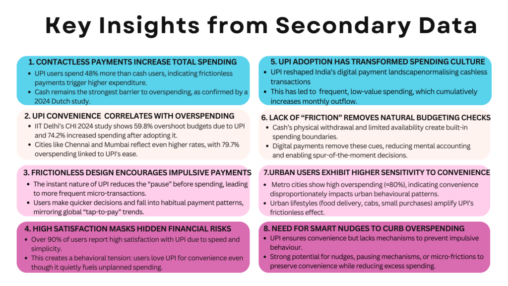
2. Research and Data Collection: Through 30 in-person interviews and a 54-response survey, we found that speed was the primary driver of impulsive spending. The frictionless flow made payments habitual. Cash creates a pause. UPI removed it entirely.
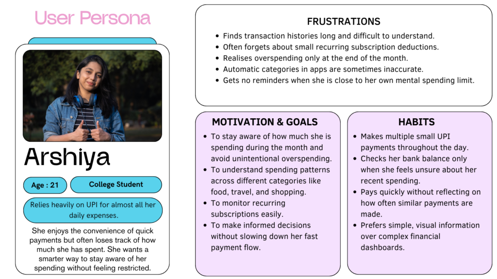
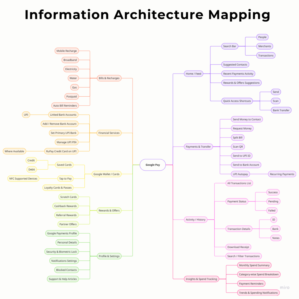
3. Data Analysis: Based on the insights derived earlier, we created user personas to represent key behavioural patterns. I then mapped the information architecture of existing UPI apps and built user journeys of current usage patterns to identify experience gaps.
4. Prototyping and Testing: From this stage onward, I led the solution end-to-end. I translated insights into behavioural nudges using UX principles and designed low–mid fidelity UI flows embedded within existing UPI patterns. The concepts were validated and refined through feature acceptance data, interviews, and usability reasoning.
The Outcome
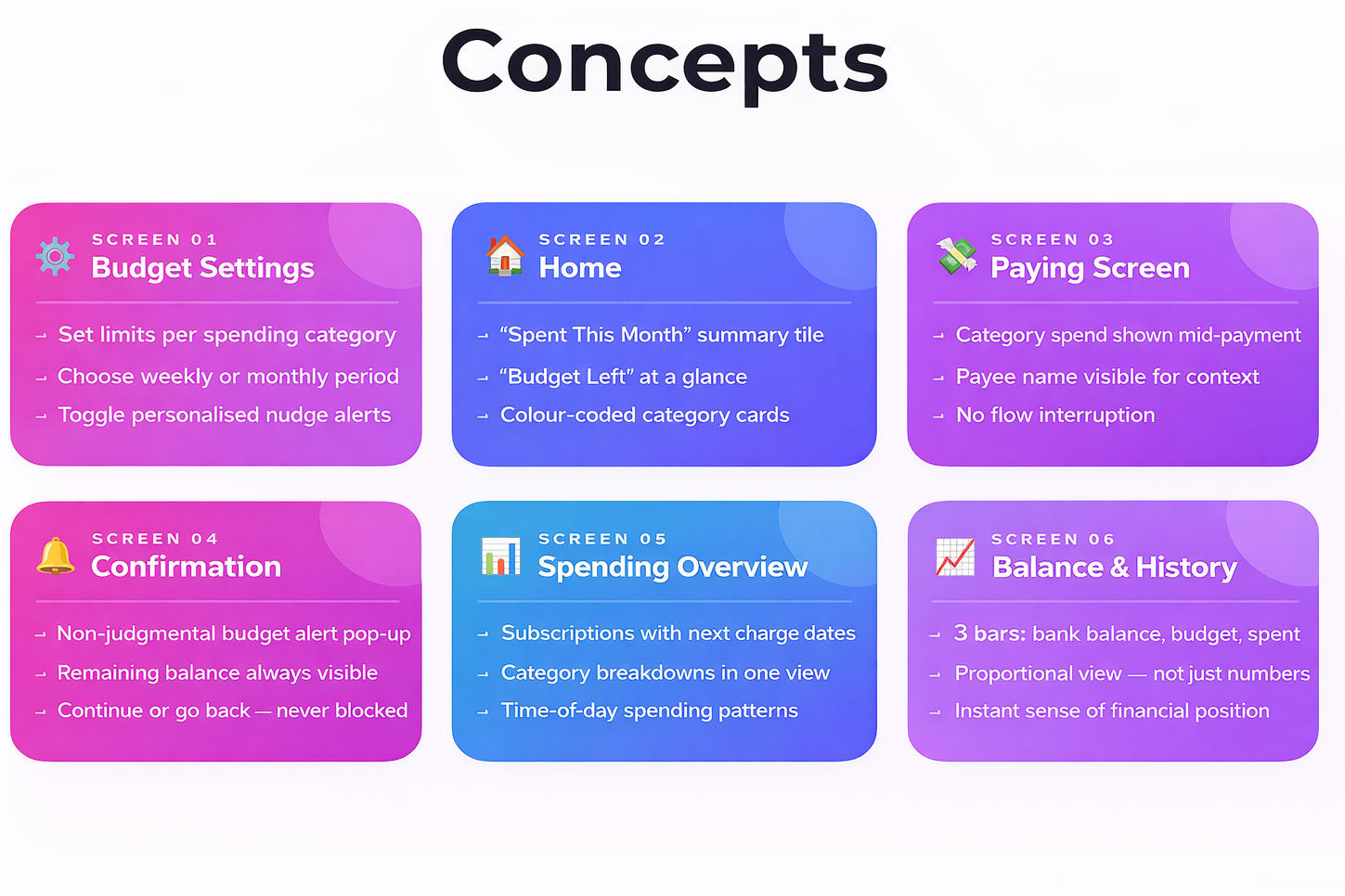
I translated these behavioral findings into six redesigned screens within the Paytm UPI interface using Figma, each anchored to a specific research insight:
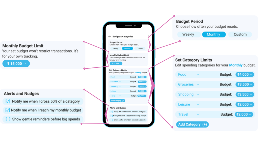
- The budget settings screen enabled category-by-category limits, weekly or monthly periods, and optional nudge preferences — all user-controlled.
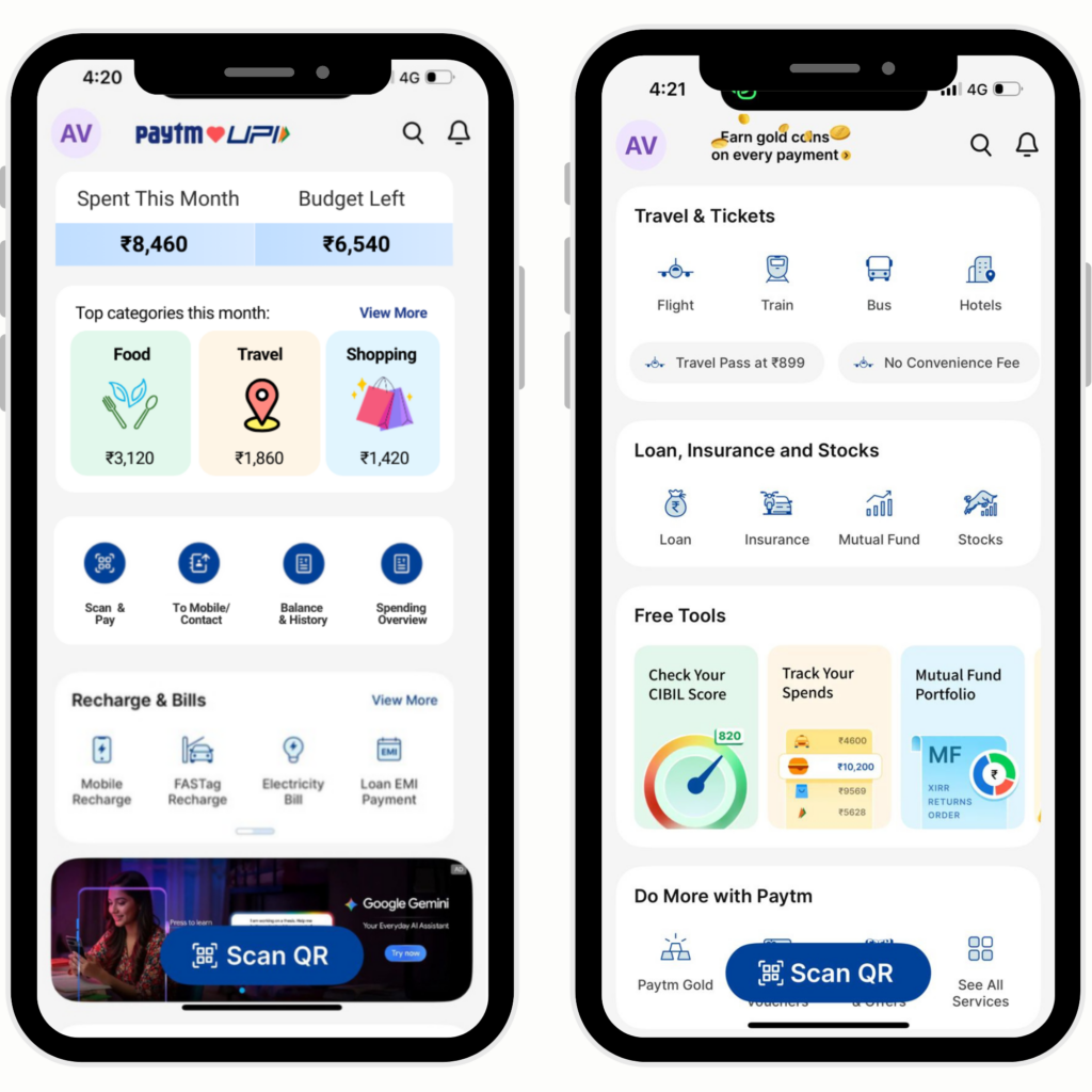
2. The home page added two summary tiles — “Spent This Month” and “Budget Left” — and colour-coded category cards. Users told us they needed a high-level snapshot, not a transaction list.
3. The paying screen showed category-level spend for the month alongside who you were paying, letting users see context without interrupting the payment itself.
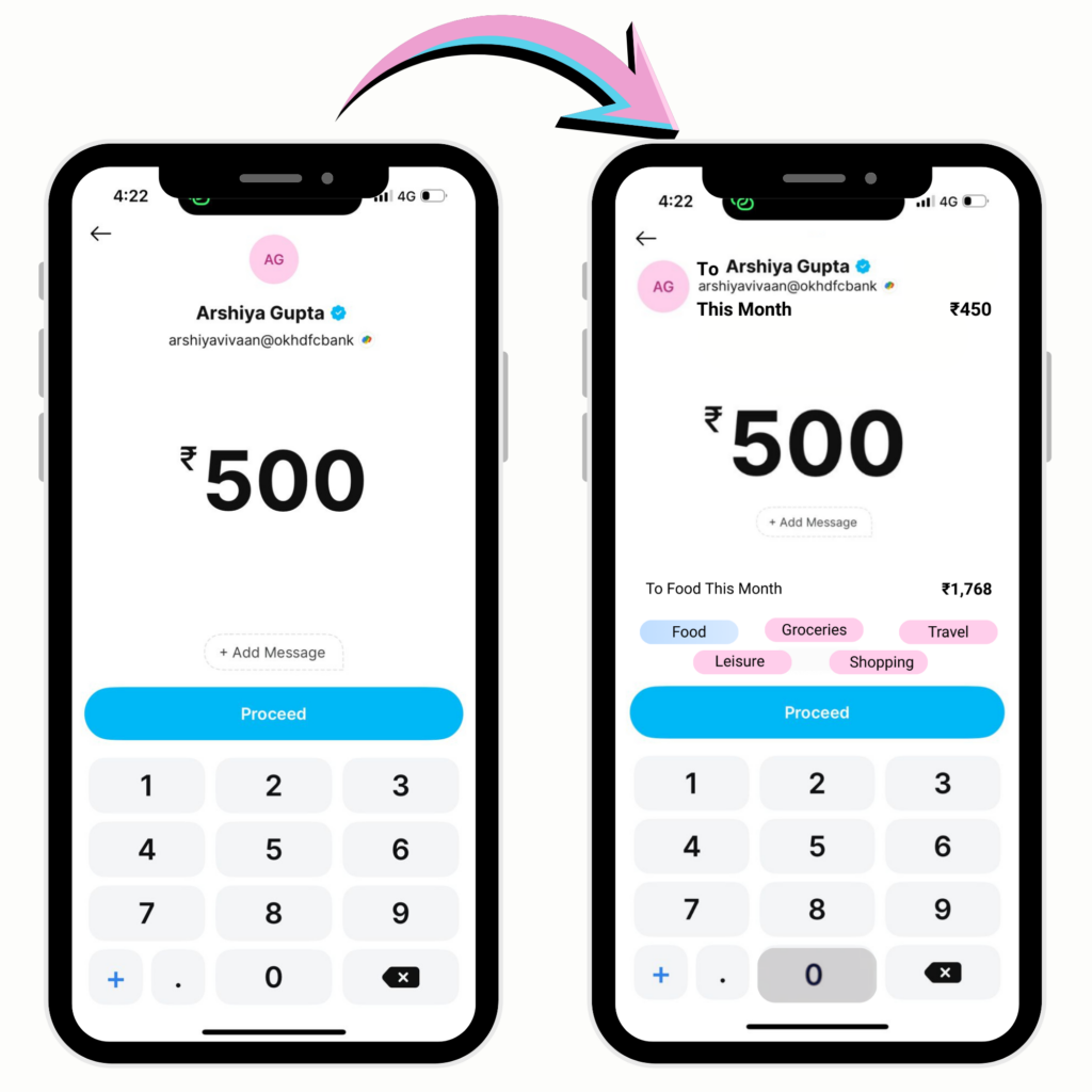
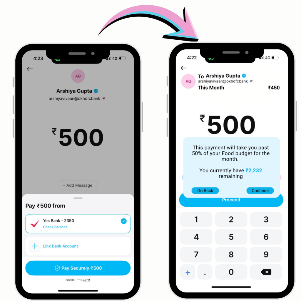
4. The confirmation screen introduced a non-judgmental pop-up when a payment exceeded a user-defined budget alert set in the category settings. Neutral language, remaining balance visible, option to continue or go back. No blocked payments.
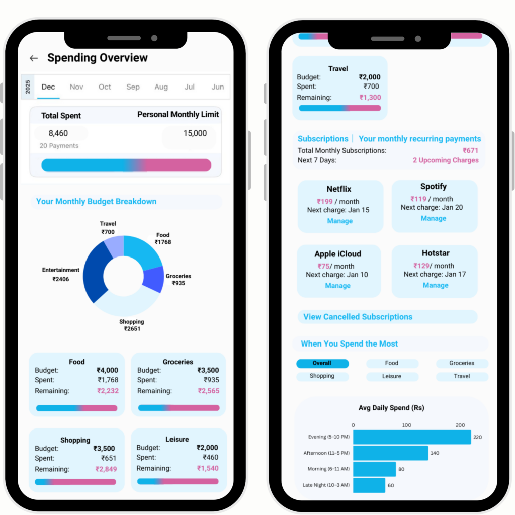
5. The spending overview consolidated subscriptions (with next charge dates), category breakdowns, and time-of-day spending patterns into a single modular view — the one place users could actually understand where their money had gone.
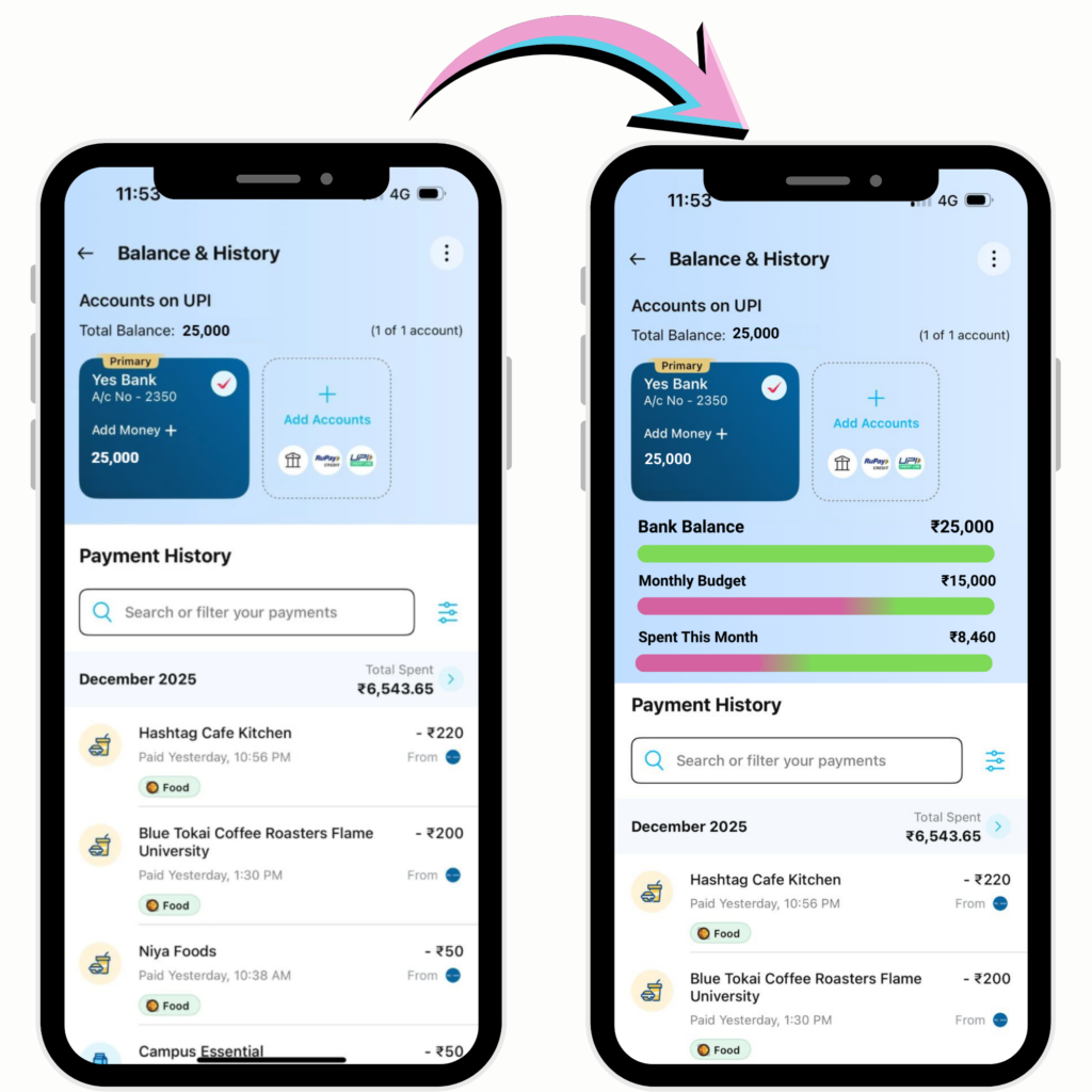
6. The balance and history screen added three comparison bars showing bank balance, monthly budget, and amount spent so far — giving users a proportional sense of their financial position rather than just a raw number.
The Impact
Shifts UPI from a passive transaction tool to an active decision-support system, enabling users to spend with greater awareness and control. By embedding guidance within the flow, it reduces impulsive behaviour while maintaining the speed and convenience users expect.